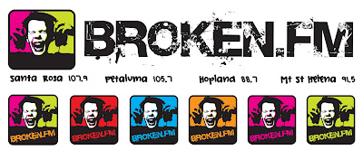
The Broken.FM logo has been one of the funnest and most exciting projects in a very long time. I met Keith and Rynie, the station owners, some time ago...they had a vision to start an alternative christian rock station in Santa Rosa,CA. The Press Democrat recently wrote an article called "Christian Rock Fills Santa Rosa Airwaves" which did a great job of capturing the essence of Broken.FM. I was approached in the early stages to design their logo and I jumped at the opportunity help develop the look and feel of this really amazing station. After many revisions the look for Broken.FM was born and we ended up with the Broken "Screamer", a young boy obviously listening to really loud and edgy music-- an image that is both recognizable and memorable. Keith Leitch said in the article that the station is folks of all ages who enjoy hard-edged music with a positive message. I think this logo captures the essence of what Broken.FM is all about, young, edgy, hard core, loud and fun.
The original logo was created as a banner for the web and then the blog. But I also created the "screamer" as a stand-alone image with the word inside to be used as an identity for Broken.FM's Facebook, MySpace, YouTube and Twitter Pages. The idea was to create consistency throughout all the social networks.
